COMPLEX RADIOGRAPHS SIMPLIFIEDSUSANNE P. SACK
Radiography can often be used to aid in studying an artist's development and style. This article describes a procedure using a transparent overleaf2 that aids in the interpretation of complex radiographs.
This is an acetate sheet that is clear on one side and frosted, for writing, on the other side. It is generally available at art and drafting supply stores. My initial examination of the painting Mother and Child by Fernand Leger3 dated 1921 indicated many artist's changes. Examination with ultraviolet light showed that the painting had extensive repaint. Radiographs were taken to learn more about the painting. The four radiographs, which show us everything on the canvas, were very intricate and, therefore, difficult to read. To determine if any relationship existed between the many artist's changes and the repaint, the following procedure was developed to analyze the radiographs.
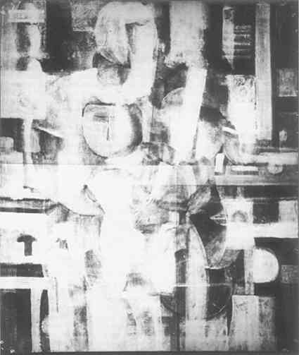
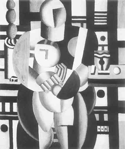
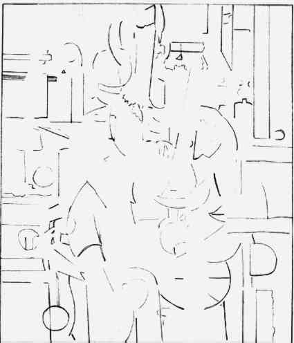
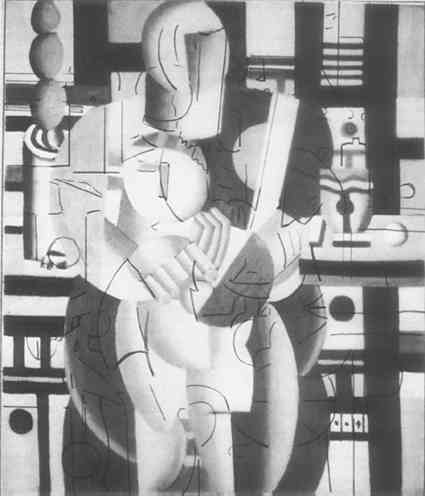
The painting is 25-5/8″ � 21-1/4″, oil on canvas, and in the collection of The Wellesley College Museum, Wellesley, Massachusetts. First, the four radiographs were photographed and montaged.4 An 8″ � 10″ print was made of the negative (Figure 1). Then an acetate sheet was placed over the print of the radiographs. While closely comparing the print of the montaged radiographs with a photograph of the painting itself (Figure 2), which was printed to the exact same size as the radiographs, the designs that could be seen in the radiographs that were not in the visible painting were traced on the acetate. When this tracing (Figure 3) was superimposed over the photograph of the painting, one could easily see the artist's changes (Figure 4).5
The author thanks Mr. Charles F. Bridgman, formerly of the Eastman Kodak Company, for his help with problems of radiography and montaging, and his encouragement in such endeavors over the years.
It should be noted that because of the densities of the pigments used by the artist, the separation of the visible painting from the paint underneath on the tracing may not be perfect. The tracing, however, does afford reasonably complete and accurate rendering.
These changes did not seem to relate to the repaint that followed more closely the designs of the visible painting. At this time, solubility tests were made, and the repaint was found to be readily soluble in mild solvents that did not affect the paint underneath. A study of Leger's work of this period followed. I compared Mother and Child to other Leger paintings, especially Three Women (Le Grand Dejeuner) of the same date in the collection of the Museum of Modern Art. I noted that in the latter painting, the edges of the planar areas were often slightly uneven and one could see where a bit of wet paint from one area was blended into the next area. By contrast, the edges on Mother and Child were very sharp and straight. Further tests were made removing repaint at edges of various areas. This revealed the more painterly quality observed in the Three Women (Le Grand Dejeuner). It became clear that the repaint had nothing to do with the artist's changes and had been added to “slick up” the painting. Consequently, it was removed. The technique developed here to learn more about this particular painting should be useful in other situations, especially where there are many artist's changes and radiographs are difficult to read. In this particular case, we can see an important stylistic development. Between the time the artist first put paint on this canvas and the completion of the painting, a considerable simplification of style had taken place. Leger reused several motifs in different combinations while clarifying his forms. The reader is referred to Fernand Leger, Drawings and Gouaches by Jean Cassou and Jean Leymarie6 to compare the painting and radiographs discussed here with illustrations 84 and T 20, 85 and T 21 on page 70, illustrations 92 and 93 on page 75, and illustration 101 on page 78. This last illustration is compared with T 28 on the same page, a larger version of Mother and Child. These comparisons show that, at this time, Leger was resolving many facets of his style, and the overleaf with the tracing helps us to see this evolution more clearly.
New York Graphic Society Ltd., 1973. |


